Exercise: Giving Instructions
Giving Instructions
07/02/2018
' Using the internet, magazines, reference books, leaflets, brochures and flyers make a collection of examples and reference materials that can help you with an illustration to fit one of the categories below:
Making a cup of tea Getting to my house Playing a tune on an instrument
Start by working out the information you need to impart and the steps involved. What are the main points? How many stages are there? Working at a fairly large scale, work out the space needed for each step. Try as many possibilities as you can.
Be mindful of the hierarchy of the elements in the composition and the dynamics needed to draw the viewers eye from one stage to another.
Decide on the tools and materials you will use for your illustration. if you use colour be aware of it adds focus and can help your communication process.
When you have finished show it to other people to check that it works both as an attractive illustration and in its main function- to give instruction.'
I have decided for this exercise I will choose Making a cup of tea. First I will do some research to see what is already out there and how other people have illustrated this work.
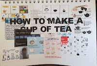
When looking at some research I came across Yorkshire Tea website that does this step by step for you. You start by choosing a mug or tea pot its brilliant click on the link Yorkshire Tea.
Whilst looking on google search for illustration and instruction on making a cup of tea in my opinion what the search brought up were all bland illustrations/instructions they are not eye catching or interesting to look at. I have decided that I want to do something completely different for this project and make something that will be both eye-catching and remembered.
I also looked on Pinterest for some research on instructions I have put the link below:
https://pin.it/4a42zep5vsi5on
 |
| Sketchbook - Research |
I also looked on Pinterest for some research on instructions I have put the link below:
https://pin.it/4a42zep5vsi5on
08/02/2018
After looking at what was out there on the internet, I looked at the different types of kettles and then I jotted down how many stages I would think I would need and a few ideas for instance - the audience who's it for? How - I would show the stages of making a cup of tea and colour.
 |
| Sketchbook - Research |
 |
| Sketchbook - Ideas |
16/02/2017
Next I decided that I would quickly draw a few ideas out and see which one I liked the most. I came up with a Comic book style and it was going to be in black and white, then I decided to do a leaflet type flip card but I decided against that Idea too see below my ideas:
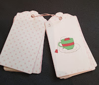
I chose to do a flip card idea binded together by rope. I came across this idea below I thought it was eye-catching and wanted to do a similar idea.
Next I decided that I would quickly draw a few ideas out and see which one I liked the most. I came up with a Comic book style and it was going to be in black and white, then I decided to do a leaflet type flip card but I decided against that Idea too see below my ideas:
 |
| Sketchbook - Ideas |
Before I jumped straight into making this idea I sketched out my idea and chose the colours I wanted to use. I chose Green and red. At first I was choosing a neutral background but it looked abit bland and I wanted it to be eye catching so I went for a polka dot theme. Baby pink so as not to take to much attention away from the main feature the instructions.
I mocked up my idea with no colours and the images I wanted to use see below:
It was a little spars so I decided that I would out each instruction onto a separate card piece. Next I went onto Photoshop and made a mock up of my first card with the baby pink polka dots.
 |
| Photoshop - Mock Up |
I downloaded some Typography off a font website because I didn't want to use my own handwriting it is called MostlyMono. I feel this type is easy on the eye and it is inviting to look at and works well with my design.
I have decided that I will use my own drawings in this design I don't want it all to be computerized but I have not yet decided if I will be using the colour from watercolour paint or filling it in in Photoshop.
20/02/2018
I did my own drawing for this project, they are not perfect but I am happy with how they have turned out:
I my first mock up of the instructions in Photoshop and I I'm am quite happy with how its turned out, but as you can see there is a black outline around the labels I wanted to get rid of that so I made it pink like the polka dots.
Below is my first mock of my instructions:
I printed these out and then made my instructions to see how they turned out.
I have decided that I will use my own drawings in this design I don't want it all to be computerized but I have not yet decided if I will be using the colour from watercolour paint or filling it in in Photoshop.
20/02/2018
I did my own drawing for this project, they are not perfect but I am happy with how they have turned out:
 |
| Sketchbook |
I my first mock up of the instructions in Photoshop and I I'm am quite happy with how its turned out, but as you can see there is a black outline around the labels I wanted to get rid of that so I made it pink like the polka dots.
Below is my first mock of my instructions:
I printed these out and then made my instructions to see how they turned out.
I really like how my instructions have turned out. I think the pink polka dots make them look vintage, My drawings are not perfect but I think they work and I'm glad I went with painting the illustrations in Photoshop I think the colours are more vibrant. I know the colours clash but they do draw your attention to the main focus which is the illustrations.
I was going to change some of these drawings but when I sent them to friends and family they said they are easy to follow. They suggested I added in taking the tea bag out the cup and stirring the cup of tea at the end.
I have decided that this is my final piece and overall I am happy that I get the instructions across clearly without using words.
21/02/2018
I posted these instructions on Instagram to see what people reactions would be towards it and people seem to like it! I have one offer to buy this the lady thinks its cute.. I am happy that I didn't change the design in the end its works perfectly as it is.
21/02/2018
I posted these instructions on Instagram to see what people reactions would be towards it and people seem to like it! I have one offer to buy this the lady thinks its cute.. I am happy that I didn't change the design in the end its works perfectly as it is.


nice
ReplyDeletecheers
Katalog Geotextile