Exercise: Packaging
Packaging
31/03/2019
'Produce a series of illustrations for packaging to be used for a new range of organic
biscuits for children. There are three varieties in the range:
Raisin Choc Chip Ginger
The client wants specifically three illustrations featuring extinct animals interacting in some fun way with a biscuit to be used on the boxes. The drawing should be in full colour, and the client would like the colours to reflect the flavour of the biscuit.
How will you stand out amongst the others?
You need to decide whether you will exploit 'pester power' or appeal to both adult and child. You may want to develop characters suitable for young children or employ a style of drawing to appeal to your all audiences. You also need to decide whether you will have hand drawn or 'Straight' typography.
You need to submit all stages of the development process - thumbnails, visuals for all three designs and a mock up for at least one.'
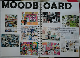
I started by doing a moodboard on packaging for kids, I didn't just look at biscuit packaging I looked at it as a whole to see what is out there. I found a lot of interesting packaging for kids especially the packaging that has see through bits on it so you can see the biscuits inside I would love to create something like this:
 |
Kids Packaging
|
Below is my moodboard:
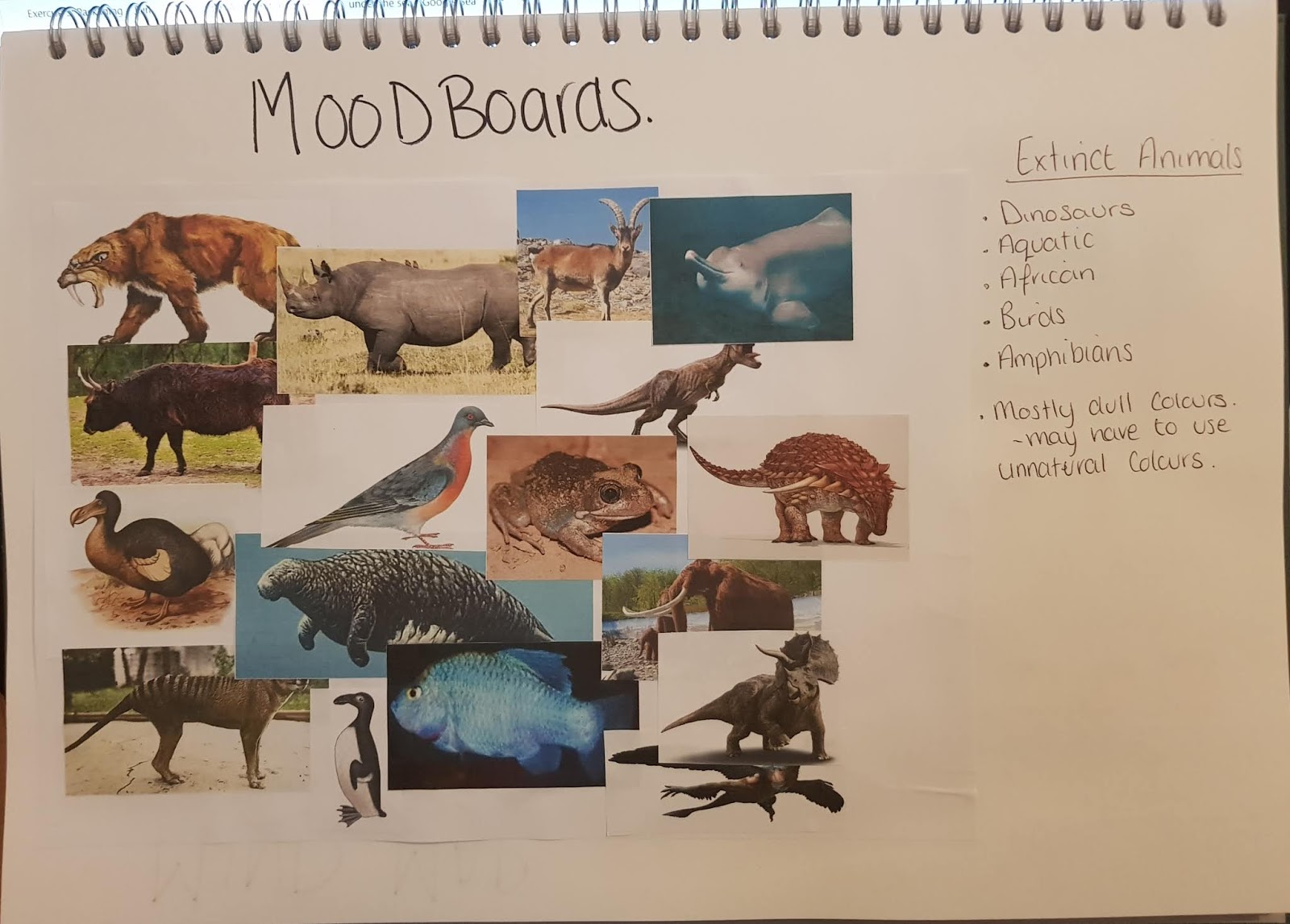
Then I did a moodboard full of animals that went extinct, the popular choice is the most famous the dinosaurs! but I want to try and stay away from that depending on what a google search brings up. Below is my moodboard on extinct animals:
Then I did a Mind map to see what kind of direction I was going to go in, with a colour palette:
After I did my mind map I picked three different animals, For the Raisin I picked Ammonite, For the Choc Chip I picked Woolly Mammoth and for the Ginger I picked Sabre tooth tiger.
 |
| Packaging Moodboard |
 |
| Extinct Animals Moodboard |
 |
| Mind Map and Colour Palette |
I went on to do some sketches of the animals interacting with the cookies after I had made my choices.
After all my ideas I decided that I was going to use 'Straight' font and not design my own. The reason is because I need more practice at it and it my weakest link, its probably the best time to do it but I feel I want to keep it on the safe side for this design.
My next step is to take my ideas and do mock-ups for them and present one for final mock up:
I decided to do quick mock ups for all the biscuits to show the general idea I have for them. The Raisin Biscuits colours are inspired by a product called V Fusion, they are bright and catch the eye and fun to look at. I googled a organic logo to put into the corner of the packaging box.
I looked at this mock up and I thought it looked a little flat so I combined both images together:
I found and downloaded a font called Good unicorn I feel its a good font to use for a children's packaging. I went with white because it stands out against the colours that I've used. I added a bit of texture into the background so its not just a flat colour, I also change the image and the way its interacting with the biscuit, before in the images above the Ammonite was thinking about the biscuit where as now its grabbed the biscuit ready to eat it. I also changed the colour palette slightly as I found it was too dark and with the moodboards research it shown that kids packaging was bright colours so I wanted to keep that going.
Next is the Mock-up for the Choco Chip Biscuits:
The first mock up I wasn't too keen on the mammoths colour I think it looked a little poorly with the oranges and dark colours in places of the fur. Also, the angle looked wrong on this mock up, the mammoth is chasing the biscuit but it looked like there was no depth to it. So, I went and changed a few things:
I coloured in the mammoth myself and then I put him in more of an angle so it looked like the (baby) mammoth was chasing the biscuit. The background of the packaging has snowflakes as I relate mammoths to snowy scenes, and the pink takes it away from that 'Christmassy' look.
The last one I started was the Ginger Biscuit and it was using the Sabre Tooth Tiger! I didn't want to make it into a playful little kitty because its a wild animal we don't go to the zoo to see a tiger playing like a cat. Below is my first mock up:
Looking at the mock up the image is blurred and I feel the Sabre Tooth Tiger is too big, so I went back and changed it slightly:
I sharpened the image and added a few lines to make it look like the biscuit is bouncing and the Sabre is making the deadly attack jump. I used the same font which was Good Unicorn which I feel is appropriate for this exercise. I added a Safari background to add depth to the colour so Its not just flat. I had to change the logo as well as the orange that was used in the logo blended into the background so I changes it to the green colour that is used for the grass.
Overall I am happy with all the outcome of all of them I feel they are different enough but still related to each other. Once again I went overboard and did final mock ups instead of just one:
By popular vote when I sent these designs out of family and friends they picked to be my final design the Ginger Biscuit design Below is my presented Ginger biscuit Final Design.
 |
| Raisin Biscuits Ideas |
 |
| Choco Chip Ideas |
 |
| Ginger Biscuit Ideas |
My next step is to take my ideas and do mock-ups for them and present one for final mock up:
 |
| Raisin Biscuit Mock Up_01 |
 |
| Raisin Biscuit Mock Up_02 |
I looked at this mock up and I thought it looked a little flat so I combined both images together:
 |
| Raisin Biscuits Mock Up_03 |
Next is the Mock-up for the Choco Chip Biscuits:
 |
| Choco Chip Biscuits Mock up_01 |
 |
| Choco Chip Biscuits Mock Up_02 |
The last one I started was the Ginger Biscuit and it was using the Sabre Tooth Tiger! I didn't want to make it into a playful little kitty because its a wild animal we don't go to the zoo to see a tiger playing like a cat. Below is my first mock up:
 |
| Ginger Biscuit Mock Up_01 |
 |
| Ginger Biscuits Mock Up_02 |
Overall I am happy with all the outcome of all of them I feel they are different enough but still related to each other. Once again I went overboard and did final mock ups instead of just one:
 |
| Raisin Biscuit Final |
 |
| Choc Chip Final |
 |
| Ginger Biscuit Final |
 |
| Final Design |

Comments
Post a Comment