Exercise: History of Illustration Part 3
My Illustrations
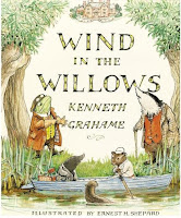
For my first exercise I had to draw two an Illustration in the style of the Artist I had picked from the list which was E. H. Shepard and one in the contemporary artist that I had chosen which was Patrick Hruby.
As I read the exercise my first thought was 'Okay this could be great' but then as I started to think it became difficult as I didn't know what to draw! So I looked back at all my past drawings and I found what they had all in common was Nature.. I look drawing animals, plants etc.
First I looked at how E.H. Shepard had done his drawings, fine lined with a pen, Fun Colours and the characters had there personality. So I created my own little creature...
  |
I used for this illustration Pin Fine Line Pens and Moz Art Water Coloured Pens, I wanted to use E. H. Shepard style of Art but still incorporate my own style into the drawing to. I think the colours are bright to make it a light picture and a few dark bits for the feathers of the outer are of the bird which adds character and depth into the picture too.
I look at the picture and there are a few things I would change like maybe add clothing to it the bird like E. H. Shepard did to his characters in Wind in the Willows, maybe use brighter colours like Yellows, Greens, Oranges to make the picture more fun to look at. All in all I think this first Illustration was a success and I like how it turned out.
My second illustration was too work in the style of Patrick Hruby. I found this very difficult to do, although his Illustrations look easy to do because he uses shapes to create his master pieces I found this particularly challenging....
As you can see it is a very basic bird, I tried to do this image in Photoshop and my skills and knowledge of the software are not up to scratch, even so it was fun to have a go in Patrick Hruby's style and even though his images look basic and easy to do ...they are not. Looking at this Picture that I've created compared to Patrick Hruby's I would change a lot of things for instance...Colour! his image is so colourful, he doesn't use 'realistic' colours in his images and they are fun to look at and imaginative. I would also add more detail, In Patricks Image you can see he has bits of details for e.g. the roof of the building and the 'Monster' neck has a lot of colours and details.
I think this exercise was successful I have learnt a lot in the process in trying to create an image in somebody else style...in my opinion its very hard to do!


Comments
Post a Comment