Assignment 3: A Poster
A Poster
17/03/2018
The Brief
'To design an illustration for a poster for a music event. You can choose:
Early Music Concert Jazz Evening Pop Group
The finished poster will be reproduce in A3 size, but you can work at the size, in proportion, that you feel most comfortable with.
The poster will include the title of the event, the date, time, place and any other information you think appropriate. You can either include in your artwork or indicate where it will be positioned.'
18/03/2018
For this assignment I chose from the list above a Jazz Evening Poster. I think this one stood out to me because I am due to go to New Orleans in 3 weeks time and its perfect to get inspired for the trip and the poster.
I started with a brainstorm:
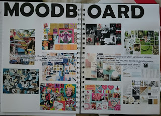
Then I went onto google search and typed in Jazz Poster's and picked the posters I felt drawn too or liked, I made a moodboard with these illustrations:
For this assignment I chose from the list above a Jazz Evening Poster. I think this one stood out to me because I am due to go to New Orleans in 3 weeks time and its perfect to get inspired for the trip and the poster.
I started with a brainstorm:
 |
| Brainstorm |
 |
| Jazz Poster Moodboard_01 |
With further research I came across and Illustrator called Jim Flora. I was instantly drawn to his work because I feel his work is fun by the use of animals, some of the illustrations for Jazz covers to me does not make sense but they are colourful and interesting. He plays around with typography in his illustrations which I found interesting and gave me the idea that maybe I could use this somehow in my poster.
21/03/2018
Next I did a moodboard of Jazz Posters that only use Typography as I am interested in exploring this side of things first, also I wanted to see what has already been created.
After looking at what has already been created I did some thumbnails of some ideas and colour schemes.
I then looked at some fonts that I liked and downloaded.
After mocking up one of my ideas I decided that it's going to be a little plain and I wasn't too sure what to put on the poster as in information wise. So, I have made another moodboard of not just posters but evening Jazz posters. This has gave me some more Ideas.
Below is one of my first ideas. I think it is colourful but I feel it lacks 'wowness' and is very plain.
I went back to research and looked at Jazz Event Posters, I did a quick google search and chose the ones that stood out to me and I liked the most. I feel the ones that I have chosen I can draw more inspiration from them, and give me some idea as to what to put onto the poster regarding information wise. Below is the moodboard I created:
27/03/2017
I have decided that I want to feature a major city in my poster for e.g Manchester my home town, London, Chicago. I want to try and create a poster that could be easily changed to feature in another city.
My next move is back to the drawing board, I have created six more idea's in my sketchbook along with colour schemes that could possibly work.
Below are my second lot of six ideas and colour scheme:
Reviewing the new ideas I came up with I decided that the one I liked best was the last one (bottom right). I came up with the name 'Jazz in the City' with some inspiration from 'Sex and the City' which was very popular TV programme.
Looking at this movie poster I wont be using the colour scheme I feel it wouldn't match the word 'Jazz', when looking at all other posters for evening or events they use more the colour schemes of Blues, greens, reds and yellows.
I put together my idea on Photoshop, here it is below:
When I had finished putting together my poster I used in the posters a silhouette of Manchester. I felt it was too plain I looked back at my ideas and on my first lot of Ideas I have suggested watercolour plash background which I have also put on one of my moodboards (moodboard 02).
Below is my first watercolour background poster:
I loved the colour of the background but I felt it stood out too much and it drew your eyes too it more than the type so I decided to pick a lighter colour.
I went a lighter colour and I know earlier I mentioned I wasn't going to use pink but I chose it and I quite liked it but I wasn't satisfied with the outcome so I picked lighter colours.
Below Is my final Idea:
I used a lighter watercolour background underneath the heading which I feel the colours go well with and it draws you attention to the title. I picked Stony Island Type that I downloaded from 1001 Fonts. I feel that this is the right type for this Jazz Poster. I used a silhouette of Manchester and a really bar and a real address they host Jazz nights on a Sunday from 9pm.
I also decided to do a poster for a different city to show that this type of poster would work for a different city, I chose Melbourne.
What's different in this poster is the silhouette it is now Melbourne and the place it being held, time and address.
I am happy with the final outcome of my poster, I feel it holds a certain formal feeling to it. There is not too much information so I feel a passer-by if this was posted on the street would easily read within a couple of seconds. Its straight to the point it tells you where the evening is and what time it starts, also an address for that person who doesn't have a sat nav or is getting a taxi and doesn't have to google where the bar is.
 |
| Sketchbook - Jim Flora |
21/03/2018
Next I did a moodboard of Jazz Posters that only use Typography as I am interested in exploring this side of things first, also I wanted to see what has already been created.
 |
| Moodboard - Typography Poster_02 |
After looking at what has already been created I did some thumbnails of some ideas and colour schemes.
 |
| Sketchbook - Ideas_01 |
I then looked at some fonts that I liked and downloaded.
 |
| Fonts |
After mocking up one of my ideas I decided that it's going to be a little plain and I wasn't too sure what to put on the poster as in information wise. So, I have made another moodboard of not just posters but evening Jazz posters. This has gave me some more Ideas.
Below is one of my first ideas. I think it is colourful but I feel it lacks 'wowness' and is very plain.
 |
| Photoshop - Idea_01 |
I went back to research and looked at Jazz Event Posters, I did a quick google search and chose the ones that stood out to me and I liked the most. I feel the ones that I have chosen I can draw more inspiration from them, and give me some idea as to what to put onto the poster regarding information wise. Below is the moodboard I created:
 |
| Jazz Event Moodboard_03 |
27/03/2017
I have decided that I want to feature a major city in my poster for e.g Manchester my home town, London, Chicago. I want to try and create a poster that could be easily changed to feature in another city.
My next move is back to the drawing board, I have created six more idea's in my sketchbook along with colour schemes that could possibly work.
Below are my second lot of six ideas and colour scheme:
 |
| Sketchbook Ideas_02 |
Reviewing the new ideas I came up with I decided that the one I liked best was the last one (bottom right). I came up with the name 'Jazz in the City' with some inspiration from 'Sex and the City' which was very popular TV programme.
 |
| Poster - Sex and the City |
Looking at this movie poster I wont be using the colour scheme I feel it wouldn't match the word 'Jazz', when looking at all other posters for evening or events they use more the colour schemes of Blues, greens, reds and yellows.
I put together my idea on Photoshop, here it is below:
 |
| Poster_01 |
When I had finished putting together my poster I used in the posters a silhouette of Manchester. I felt it was too plain I looked back at my ideas and on my first lot of Ideas I have suggested watercolour plash background which I have also put on one of my moodboards (moodboard 02).
Below is my first watercolour background poster:
 |
| Poster_02 |
I loved the colour of the background but I felt it stood out too much and it drew your eyes too it more than the type so I decided to pick a lighter colour.
 |
| Poster_03 |
I went a lighter colour and I know earlier I mentioned I wasn't going to use pink but I chose it and I quite liked it but I wasn't satisfied with the outcome so I picked lighter colours.
Below Is my final Idea:
 |
| Final Poster_01 |
I used a lighter watercolour background underneath the heading which I feel the colours go well with and it draws you attention to the title. I picked Stony Island Type that I downloaded from 1001 Fonts. I feel that this is the right type for this Jazz Poster. I used a silhouette of Manchester and a really bar and a real address they host Jazz nights on a Sunday from 9pm.
I also decided to do a poster for a different city to show that this type of poster would work for a different city, I chose Melbourne.
 |
| Final Poster_02 |
What's different in this poster is the silhouette it is now Melbourne and the place it being held, time and address.
I am happy with the final outcome of my poster, I feel it holds a certain formal feeling to it. There is not too much information so I feel a passer-by if this was posted on the street would easily read within a couple of seconds. Its straight to the point it tells you where the evening is and what time it starts, also an address for that person who doesn't have a sat nav or is getting a taxi and doesn't have to google where the bar is.


Comments
Post a Comment