Exercise: Editorial Illustration
Editorial Illustration
08/02/2019
'Buy a Newspaper with a supplement, cut out any article that contains an illustration.
Notice the heading for each article and read the text that the illustration refers to, how its ideas relate to the meaning of the piece, how it extends the content of the piece.
Analyse the type of illustration - is it decorative, conceptual, informational? Does it use metaphor to convey an idea or does it have a narrative base? is it representational, abstract or diagrammatical?
Your task is to provide a visual interpretation of one of below:
How green is your food? The object of my desire
The best restaurant in town Finding your family history
Loves me, Loves me not A interview with Melvin Bragg
Throwing your money away Paris, still the best place on earth
You may find it useful either to find some text that suits the heading or write a few sentences yourself. Your interpretation can be as personal or as open as you like or you might decide to create your image in a more interpretive or conceptual way.
Approach the task in a series of stages. Start by reading the article all the way through to get a sense of its meaning. You might find it useful to sum up the article in a short series of sentences.
Next go through the article with a highlighter pen and identify sentences and words which you consider to be important. If you've been given a heading by an editor, that might point you in the direction of the aspects that you'll need to respond to in your illustration. Finally, read the text again with a sheet of paper to hand and sketch down ideas as you read through the article.
Make a list of words that describe the illustration you want to create. This should be as clear as the analysis of the illustrations in the newspaper or magazine and will help you decide how to proceed. Will it contain information, offer opinion, clarify or decorate the text?
Create a visual in response to your ideas. Be realistic about your abilities at this stage and choose content according to both the meaning you want to communicate and your confidence in achieving this visually.
When you've created a line visual that you feel is appropriate for the article go to the artwork stage. Identify a palette and medium that you think sums up the sense of the content you may find that you can photocopy your visual and colour it in or scan it digitally and explore several colour variations before moving onto the final artwork.
Using materials and a stylistic approach which you feel comfortable with, translate your visual into artwork.'
To start I looked through our local magazine at some articles that caught my eye:


Then I looked at the newspaper at articles where either the headline or illustration caught my eye:


I found that some of the articles are true to their headlines or illustrations where as a few of the articles play with what they are putting across for instance the illustration under the headline 'Blatantly anti-Sematic' I find this illustration quiet quirky and funny.
I have decided that I will go with How Green Is Your Food? I personally find this a tricky one and certainly will have to delve deep to find the right illustration for this, I am tempted not to go too literal and the brief says it is open and can be as personal or creative as I want it to be.
I started by looking on the internet at some articles about carbon foot printing on food and how meat and diary produce the most carbon footprints which is interesting. Then I started to think about recycling, eco friendly food, earth, organic foods etc. All this in mind I already had an idea how I wanted my image to be so I wrote down the words of what I wanted my image to look and feel like. Here are the descriptive words that I want my illustration to be like:
 |
| My List |
As you can see I have gone for a more positive image as I personally hate reading, watching or listening to the news.
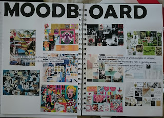
Next I did some more research and had a look at eco friendly images of carbon foot printing, food and the earth to see what was out there already and to get some inspiration. I made a moodboard with the images I have chosen which you can see below:
 |
| Moodboard |
 |
| Sketchbook |
 |
| Sketchbook |
From the six ideas I came up with I like ideas number 2 and idea number 6, I cant make my mind up which one I should develop. Whilst I was trying to decide which one to do I looked a different colour palettes and decided to go with a simple one:
 |
| My Colour Palette |
This colour palette has everything I need, its simple and not too complicated which goes perfectly with the kind of illustration I want to create.
10/02/2019
After thinking about it for a couple of days, I decided to go with sketch number 6. I like the sketch how it is but I'm going to develop it abit further as it needs to be more eye-catching and I think more fruit and veg adding to it.
I did my idea in Photoshop here is the first draft of it:
I sketched out my idea in my sketchbook but in a bigger size. Then I developed it in Photoshop. Its very basic. Next I printed it off and made some notes onto the developed picture of what possible changes I could make to it:
As you can see I have wrote quite a lot of changes I could make to this image. I am trying to be critical of my work and trying to make it stronger.
One of the changes I was going to make was the shape of the world and make it into a heart shape, but when I asked the opinion of my partner he said I should keep it round so I went with his advise. The other changes where to bring in the characters so they were closer together, crop down the image, add a gradient to the blue sky to make it seem not as flat, and to add type? maybe. Below is the changes I made:
I made a few changes. The image is not as long now, the sky has a gradient and fades to a lighter blue, I made the earth darker cause I found in the last Image that it blended in with the sky too much, I cropped the picture so the grass wasn't as thick and I moved all the characters together. But looking at it I still wasn't happy with the image so I made some more changes:
I added type. Before I added the type I looked at the popular types that newspapers use and I picked Franklin Gothic. I decided to add type because you could grasp what the image was trying to tell you just by looking at it .. or is that a good thing? I decided to make the world a little lighter as it was too dark.
The Image was getting better to me but there was a few bits on it that needed changing. I felt that I needed to move the characters around as it was abit busy on one side and I need to make it balance out. Also the world wasn't quite in the middle and it bothered me.
So, above is my final image. I changed the characters around I made the sky a tad bit lighter with a gradient still, the type I kept the same but changed green to literal green colour and the world is more central.
Overall I'm happy with my final image I feel I went a different way with it compared to other work I have seen. I feel I hit my target on making it cheerful and easy to look at and maybe a little intriguing to the eye.
10/02/2019
After thinking about it for a couple of days, I decided to go with sketch number 6. I like the sketch how it is but I'm going to develop it abit further as it needs to be more eye-catching and I think more fruit and veg adding to it.
I did my idea in Photoshop here is the first draft of it:
 |
| Original Sketch |
 |
| Photoshop Mock up_01 |
 |
| Idea_01 |
As you can see I have wrote quite a lot of changes I could make to this image. I am trying to be critical of my work and trying to make it stronger.
One of the changes I was going to make was the shape of the world and make it into a heart shape, but when I asked the opinion of my partner he said I should keep it round so I went with his advise. The other changes where to bring in the characters so they were closer together, crop down the image, add a gradient to the blue sky to make it seem not as flat, and to add type? maybe. Below is the changes I made:
 |
| Idea_01 Changes |
I made a few changes. The image is not as long now, the sky has a gradient and fades to a lighter blue, I made the earth darker cause I found in the last Image that it blended in with the sky too much, I cropped the picture so the grass wasn't as thick and I moved all the characters together. But looking at it I still wasn't happy with the image so I made some more changes:
 |
| Idea_01 Changes |
I added type. Before I added the type I looked at the popular types that newspapers use and I picked Franklin Gothic. I decided to add type because you could grasp what the image was trying to tell you just by looking at it .. or is that a good thing? I decided to make the world a little lighter as it was too dark.
The Image was getting better to me but there was a few bits on it that needed changing. I felt that I needed to move the characters around as it was abit busy on one side and I need to make it balance out. Also the world wasn't quite in the middle and it bothered me.
 |
| Final Image |
Overall I'm happy with my final image I feel I went a different way with it compared to other work I have seen. I feel I hit my target on making it cheerful and easy to look at and maybe a little intriguing to the eye.

Comments
Post a Comment