Assignment Two: Point of Sale Display
Point of Sale Display
24th August 2017Feedback from Assignment 1
Before I get stuck into this exciting assignment I want to write about the feedback I got from my tutor on assignment 1. I took my feedback as all positive and I like the fact that I have someone to suggest how to hone my skills and improve them!
To start off I did in one of the exercises a bird on Photoshop and I'm not very skilled at computer art so it was great to have ago and experiment with this software. The feed back was great and here is what my tutor wrote to me:
'I would encourage you to continue experimenting, to try combining techniques, and broaden your understanding of illustration by continuing to look at other artists, which will help when illustrating different subjects or themes. Your E.H. Shepherd illustration has a vintage feel to it, and your use of digital techniques for the Patrick Hruby inspired illustration is fitting.' - Tutor
I feel that since she has given me this advise I have continued to do my research and looked at all kinds of artist through my journey to Assignment 2 and I have definitely experiments using different types of materials in my illustrations.
For the 'Getting the Gist' exercise this is the feedback I have gotten:
'Your depiction of Trump with rabbit ears pretty much communicates the story on its own, without the need for the Easter Rabbit, Your Typography needs a little refining however. The second needs a rethink, the text you have chosen for this already has an accompanying illustration, if you wish to revisit this I would recommend picking a piece of text without an illustration.' - Tutor
Again positive feedback in my eyes, I like my trump illustration how it was including the Easter Bunny, but I can see how Trump just having Bunny ears just communicates the story itself.
I agree with my tutor my typography doe need a little work and throughout my sketchbook I have given it more thought for e.g. 1950s exercise I chosen a 1950s style Type to go with the theme of the exercise, and I'm still continuing to think about the typography that I'm using in research and illustrations.
As for the second illustration 'Space Junk' it was one of my favourite illustrations to do but I can see why my tutor asked me to pick text that had no illustration beside it, maybe the illustration could have influence the work I did for it?! I decide this time not to revisit this exercise I liked the work I did for it but I am grateful for the feedback on it too, in future however I will be revisiting any of my work my tutor suggests to revisit.
For my for Assignment it was to create a 'Greetings Card' to introduce myself:
Good consistent use of pattern in both sides of your greeting card, and it is great to see some of your influences featured in the design, some minor adjustments. The 'Hello' part of the front has some edges of the card showing, which is a little messy and distracts the overall composition. Also there is an outline around some of the birds, but not others, which makes it a little inconsistent . I'm also unsure why the pink line is there. This may seem a little nit-picky but it is important that you develop a critical approach to your own work. A good effort however. ' - Tutor
Looking back at the 'Greetings Card' I made I agree with some of my tutors views and I don't think that she was being nit-picky at all, First the 'Hello' was on a separate piece of card so maybe I could have just wrote it on the original piece of card which would make it less messy.
The birds however I didn't notice there was an outline the only thing I could think of was the drawing of the beaks on it makes it seem there is an outline round the body that definitely wasn't the look I was aiming for but I can take this feedback to future exercises/assignments.
The only pink line I think my tutor is talking about is the one around the front of the 'Hello' on the front, I tried to make it stand out but it seems to make it more messy.
My tutor has suggested some research for my Typography, she has suggested I look at Vic Lee and Stefanie Clemen.
I am really happy with my first feedback on my first exercises and assignment all in all it was very positive.
The Brief
'To create images which will be used within a campaign for a super market, to package and promote a range of seasonal foods.
The supermarket is respected for its quality of food they supply. They want to promote this notion of quality in their design packaging.
The finished images will be 'Point of Sale' display sited in a store near to the fruit and vegetables. The Final reproduction size will be 12 x 12 inches. Your Artwork can be same size or in scale.'
' Create an illustration of fruit or vegetables. One illustration for each of the ranges:
Summer Autumn
Your images should be objective and based upon direct observation. For Each range you may choose an individual piece, dissect or partly sliced sections, or create a group of several pieces.
Then create separate images for Summer and Autumn that reflect both the produce you previously selected and aspects of the season itself. There are no limitations in terms of content - you can include other objects; a place; patterns; people or a combination.'
I have already decided that I will be using Typography for my assignment so I took my tutors advice and did some research on the two illustrators that use typography ion their work Vic Lee and Stefanie Clemens.
26th August 2017
I started this assignment by first doing some research on Vic Lee and Stefanie Clemen, they are two different styles, very different and I feel that I am drawn more to Vic Lees Typography style work.
I like Vic Lees work more because I like the crisp colour of Black and White, I feel it draws your eyes straight to it and stands out.
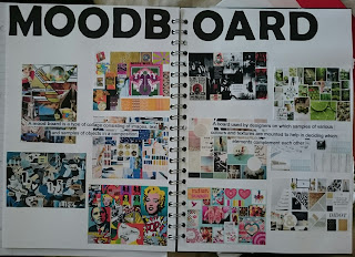
after looking at typography I decided to start this project by making a moodboard of fruit and vegetable displays just any type of fruit and veg to see what was out there in supermarkets:
26th August 2017
I started this assignment by first doing some research on Vic Lee and Stefanie Clemen, they are two different styles, very different and I feel that I am drawn more to Vic Lees Typography style work.
 |
| Sketchbook |
 |
| Sketchbook |
after looking at typography I decided to start this project by making a moodboard of fruit and vegetable displays just any type of fruit and veg to see what was out there in supermarkets:
 |
| Fruit/Veg Displays Moodboard |
I then chose what I wanted to work with in this assignment and I chose Fruit! I chose fruit because I feel the colours are more vibrant and rich and I would like to try and incorporate that kind of colour into my 'Point of Sale Display'.
After deciding what to work with I then did two more moodboards, one for Summer Fruit and one for Autumn fruit. I have decided to use Reds, Purples, Blues for the Summer Fruits and Orange, Yellow and Greens for the Autumn fruits.
 |
| Summer Fruits Moodboard |
 |
| Autumn Fruits Moodboards |
I then decided to do some observational drawing using different types of media, Water colour paints, Pencil crayons, Water coloured pencils.
 |
| Sketchbook |
 |
| Sketchbook |
The drawings are a little flat but at this stage I'm just testing what works well and what doesn't and what type of materials I want to use.
I am leaning towards at the minute either Pencil crayons or Water coloured pencils in my opinion would work well.
27th August 2017
Whilst I was at work I was thinking at about what I could do for this project I decided that I wanted to included a woodgrain from an outside table, so I got in touch with a friend who does photography and he provided the wooden photograph for me in this project below:
27th August 2017
Whilst I was at work I was thinking at about what I could do for this project I decided that I wanted to included a woodgrain from an outside table, so I got in touch with a friend who does photography and he provided the wooden photograph for me in this project below:
 |
| Photography By Jono |
Next I wanted water colour splashes so I googled them because I wanted bright Summer colours here is the image I used:
 |
Googled Splashes
|


 |
| Final Piece |
I am really pleased how this turned out and I feel like I have progressed in my digital skills and see my vision come to life, Its now amazingly perfect but I feel that with this piece I defiantly hit the nail on the head...as they say.
28th August 2017
Next was the Autumn Fruits Point of Display I decided to keep the theme of wood and water colours in the picture. Here is the process:


 |
Final Piece
|
I like the way this one turned out too but there is always time for improvement.


Comments
Post a Comment