Exercise: Abstract Illustration
Abstract Illustration
06/02/2018
'Listen to a piece of instrumental music by a musician such as:
George Gershwin The Gypsy Kings Beethoven Miles Davis
As you listen to the music create marks which convey your interpretation of the essence or mood of the piece. Bring a degree of self-expression to the exercise. Be selective in your use of materials, colours, marks and textures.
Stand back from your worksheet and choose an adjective or word that you feel describes the tone of the piece. Go through your drawings and choose a square area that you feel communicates the meaning of your chosen word and has visually interesting qualities.
Using a square format and working at any size, reproduce your selected area. Starting with your chosen adjective, introduce colours, textures, shapes. Choose any media you like for this exercise and experiment by mixing them. Try not to over complicate the image.
Be conscious of the mood you are trying to convey. You can add forms or create the shape of an element with some representational value.
Do you think your image would work as an illustration for a cover of a CD for the music you listened to?'
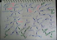
Below is my abstract illustration that I created whilst listening to the music:
 |
| Sketchbook - Abstract Illustration |
I used to create this piece charcoal pencil to create the black outlines and for the colours I used chalk. I wanted to use bright colours for this piece because the music is upbeat and reminded me of a sunny day. I didn't colour the whole page as I didn't feel the need to create a full page of colour in this instance.
I have decided to call this piece Flowing.
I have decided to call this piece Flowing.


 |
| Sections of Abstract Illustration |
I did a poll on which section I should develop as I couldn't decide for myself as I think they would be all quite interesting to see. The section that won is number 2 and I think I will work in CD size which is 12cm x 12cm.
Above are two developed piece from the poll I did earlier today. I used to create these two images Pencil, Chalk and Gouache Paint. After developing the first one as you can see there is a lot of white on the illustration and I thought it looked a bit empty. When coming to developing the second piece I decided to make some of the curves larger and I added a yellow background to give it more colour.
Below are the images more close up. My next stage is to put design two into Photoshop and have a play around with the colours and to see how they would look as a CD.
Below are my mock ups of my abstract illustration on the front of a CD cover:


If I was to pick a final piece I would pick..well its between two see below:


I don't think my abstract illustration works as a CD cover but I am happy with the results.
 |
| Sketchbook - Developed Section |
Below are the images more close up. My next stage is to put design two into Photoshop and have a play around with the colours and to see how they would look as a CD.
 |
| Design 01 |
 |
| Design 02 |
Below are my mock ups of my abstract illustration on the front of a CD cover:


If I was to pick a final piece I would pick..well its between two see below:


Comments
Post a Comment