Exercise: Image Development
Image Development
05th January 2018
' Cut two 'L' shapes out of stiff paper or card. Explore formats, to zoom in and out of compositions.
Take an image which has a range a content - a family photo, and interior from a magazine or another artist's work - and enlarge it to A4. Scenes with action with a background and foreground can be most useful here.
Use the 'L's to create edited versions of each image. Try presenting it in different formats. Repeat this using your photocopies.
1. Do some images seem to have more drama because of the way you have cropped them? Has the focus changed - Have you made the original subject of the image seem more or less important?
Choose a word for each image that relates in some way to the content. Using one of the images as a basis for an illustration, draw up your artwork to make a poster. Add colours and textures to emphasise your message.
Use the word you selected as the title and reproduce it in a typeface you feel suggests and reflects the meaning of the word itself.'
I really wanted to use this illustrator I found called Drew Millward, His illustrations stood out to me straight away when I stumbled upon him, I feel I can relate to his work because its different, fun and eye-catching. Below is the original illustration I was going to choose:
 |
| Drew Millward |
I felt that he did have a lot of content in his work but mostly the images were on the same line for example the monsters in the illustration are similar. In the end I felt I would not get enough content out of this illustration so I picked a completely different illustrator!
I Typed in google seaside and as I scrolled I came across and Artist called Trevor Mitchell. He does all different types of scenes and I decided to pick from his illustrations. I decided to do some research on Trevor Mitchell as I didn't know anything about him as I just accidentally came across him.
 |
| Research Trevor Mitchell |
Now that I have looked at Trevor Mitchell's background and his work I chose a piece with a lot of action which I feel was appropriate for this exercise. See below:

I felt drawn to this piece of work because I love the seaside, and when looking at it I could easily make 10 separate pieces out of this work using the 'L's'. I printed this illustration out in A4 size and then used the 'L's' to create separate images from this illustration.
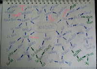
Below is my sketchbook of the illustration I had chosen and made from it the 10 separate pieces I have created out of it:

 Below is a closer look at what I have chosen:


The image that stood out to me the most and in my opinion would be the most fun poster to make is the Ice Cream Van that I named Ice Cream. After picking this image I decided the next step would be to make a moodboard of poster ice creams to get my imagination flowing and the type of colours that have been used, I notice that the ice cream van has a vintage feel to it so I might keep that theme going ...
Next I did some sketch ideas for my poster..
Below is my sketchbook of the illustration I had chosen and made from it the 10 separate pieces I have created out of it:


 |
| Moodboard |
Next I did some sketch ideas for my poster..
 |
| Sketchbook Ideas |
 |
| Sketchbook Ideas |
I decided to pick image number 3 to develop I quickly drew it out bigger and changed a few things on it, I have also decided when I was doing this that it would look better done on Photoshop with different materials added into it. I want to keep this poster quirky as in the brief it doesn't give me any boundaries apart from using my original image as a basis and creating a poster from the title I had given it. Below is my initial idea...
 |
| Sketchbook - Poster Development |
the above sketch was made with Marker pens for the ice cream and cone the background was water colour paint, I wanted to add different media I cam up with maybe using tin foil with the cone, Adding felt to the cherry just to give it some texture. Below is the result i got using Photoshop:
 |
Photoshop development
|
 |
| Sketchbook |
04/02/2018
I looked back at my moodboard and there was a few things that stood out to me in it and i used them ides and put together my next idea with colour palette.
 |
| Sketchbook Idea_02 |
Here is my Final Piece:
 |
| Final Piece |
As you can see i change the colour of the ice cream, against the cream background you could not see the mint green that i used so i decided that chocolate would be the best colour. I feel that i have kept the 'Vintage feel' with the colour palette i used but kept the 'modern' look to it too. I found on Font and ice cream font that i thought fir this poster.
I am happy with this last image even though it is Basic i feel that it works and its not over worked.


Comments
Post a Comment