Exercise: Making a Mock-Up
Making a Mock-Up
' For this exercise you are going to mock-up a book cover. From your book shelves or from the library choose a book title that appeals to you. Read the blurb on the back of the book (or the whole book if you have time).
You may have already done an illustration you can use or you may be inspired to make a new one. If you are using one you have already done you may need to modify it in some way. You may need to play with the colours, edit or adjust the composition or alter the size and scale. Don't make changes to the original.
Either copying the design of the cover and adding your illustration or design to the cover from scratch, make sure that you can incorporate the title, author and publisher's details.
In your learning log not how well your image worked and any technical problems you had overcome to make a convincing mock-up. '
I was torn between three books that i wanted to work with, here are the three books:
- Wizard of Oz
- Alice in Wonderland
- Stephen Kings IT
I sent out a vote to friends and family in the end because I could not choose which one i wanted to work with. The book with the majority of the votes was Alice in Wonderland!
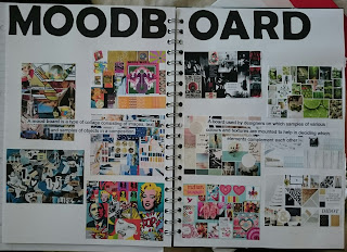
I just wanted to get straight stuck in but before I got ahead of myself i decided to do a moodboard or different types of books that just caught my eye, I found these books by just typing in google search book covers. Below is my moodboard of book covers:
 |
| Book Cover - Moodboard |
My next step is to do a moodboard on Alice in Wonderland book coves to see what has already been done and to see what catches my eye, colour palettes that people have used. I could have sat there all day just looking at google images of different Alice in Wonderland book Illustrations they are all so create and brilliant it got my imagination flowing. Below id my moodboard:
 |
| Alice in Wonderland Book Cover - Moodboard |
I already have some artwork that I created for fun in my own time and its my chance to show you some of the work I have done on Alice in Wonderland, I have three pieces to show:
 |
| Alice in Wonderland - Water Colour and Pen |
I have one of Lewis Carroll's complete collection books with original Alice in Wonderland illustrations in it. This piece i did was inspired by this book. I used my water coloured paints on A3 background and splattered different colours to get the splodging effect. I then used pen to draw Alice from scratch onto the background. The piece currently resides in my mums bedroom in a frame. It is one of my favourite pieces of artwork I have created. Although its simple I feel it is elegant and detailed.
 |
| Mad Hatter - Water Colour and Pen |
 |
| White Rabbit - Water Colour and Pen |
The White Rabbit is also done on water colour paper with Pen and Water Colour Paint. I used a 5/0 paintbrush to create this image. It is now mounted on black card and is also in a portfolio of some of my work. Again, this is inspired by Lewis Carroll's original drawings.
I could possibly rework these images into a book cover I might experiment with them and see if it works or not.
I also have an Alice in Wonderland piece i worked on in collage see below:
 |
| Collage Work - Alice in Wonderland |
From what I remember of the brief we had to take pages of random books and pick out words in that book and draw an illustration onto the page. I used Pen and Pencil Crayon and lightly coloured in Alice's dress in blue. I did a series of different illustrations of different this one includes a Eagle, Cars and United badge to name a few.
I put my personal drawings into my sketchbook as they fitted into this particular project as they are all Alice ion Wonderland based and I could use them in some way.
 |
| Sketchbook - My Own sketches Personal Illustrations |
Next I am going to do some thumbnails of ideas and pick which ones I like the best and Mock them up on Photoshop to see what they look like then I will pick a colour scheme to go with it.
 |
| Sketchbook - Ideas_01 |
 |
| Sketchbook - Ideas_02 |
Then I googled images and silhouettes of Alice in Wonderland characters:
 |
| Sketchbook - Images I could Use |
Upon googling these images I thought they were perfect to use when looking at my jotted down ideas. I especially like the Diamond wall paper at the bottom.
As you can see mixed in the images above there is a picture of type that is used out of cards this is not actually downloaded this is something i made myself out of old playing cards i wanted to use this somehow but it didn't work out you will see the image later.
 |
| Type made out of playing cards |
I really wanted to use this idea...
Next I did some mock-ups on Photoshop of my ideas:
 |
| Sketchbook - Mock-Ups |
 |
| Sketchbook - Mock-Ups |
I wrote notes next to each one of these books covers noting changes I could make for instance, In all of my mock-ups I haven't put a bar code and 1 and 2 do not have the author on the front cover. I also wasn't too sure about the pink in the first idea I thought that maybe it wouldn't attract all audiences. So I made a new idea by just changing the colour of the font and the background.
Number 4 didn't work I tried to use the type I created earlier against the background that I liked but the background swallowed it:
 |
| Failed Idea |
After the changes I have made here are my Ideas:
 |
Photoshop - Idea_01
|
In this idea you have my illustration that I created of Alice. I have deleted the background around the image. I also added I white square behind Alice as I think this helps the image stand out. I have added in the author on the front page. The font is downloaded and its the original Alice in Wonderland font. I am careful about what font I used because of past feedback when I first started the course.
Ignore the black lines that are separating the spine of the book from the front and back cover this is not part of the design it is just to show where the spine is.
The back cover I also decided that I will use a white square and put the type in it again, using the same type as Alice in Wonderland. I also didn't want there to be a lot of blank space underneath the type so i re looked at the silhouettes I googled and picked out for this one The White Rabbit. I think it sits nicely and brings a certain elegance to the work. I added for reality a bar code and placed it where I think it would fir in the design.
Overall I am happy with this idea I am still not sure about the pink but I think it goes with the colour of the illustration I used.
 |
| Photoshop - Idea_02 |
I had this idea from a playing card:

I decided to use my illustration again and I didn't want to restrict it to inside the box. I used a blue outline for the box because the card I was using had a blue outline too. I also added hearts like it has on the card itself. The only thing I didn't add on the front cover of the book design was the letters and hears outside the box I thought it would look too busy. Again, I used Alice in Wonderland font.
I used the black line to section off where the spine would go.
When creating this idea I came up with some faults for example sometimes changing the colour of the background would change the whole image and colour over boxes or type, I had to flatten the image to sort this out.
I feel that this design is one of my strongest and favourite designs. When asking friends they think it looks elegant, sophisticated and appeals more to a wider audience.
14/03/2018
 |
| Photoshop - Idea_03 |
I took a different approach to this one I thought i would use a different character on the front cover and I feel it works quite well.
At first my original idea was to have the book cover stripped with pick and purple like the Cheshire cat but when look at the actual character I decided against that idea I didn't think it would look that good, So, looking more at the Cheshire Cat images I decided to go with the most recent Cheshire Cat colour:
 |
| Google Image - Cheshire Cat |
I used my colour selector in Photoshop and picked apart of the fur that was blueish/Grey. I also picked the bright colour of the eyes that would draw your attention to them on the front cover. I used the same font but this time the title wasn't split it was put together at the top of the page, and I made the font whit which makes it stand out against the background.
I didn't hit any technical difficulties with this design it was straight forward.
The back cover doesn't have much on it but I feel it is a nice simple design and I have added in the silhouette this time keeping in theme with the Cheshire Cat and added the bar code where i think the appropriate place is. I have also added a boarder around the white box which I felt was appropriate for this design it separates the white from the grey/blue background.
I feel this is also one of my stronger designs even though it is simple but sometimes simple is more effective.
 |
Photoshop - Idea_04
|
So I decided to try and reuse the pattern from earlier on an already mocked-up idea and change the background and colour of the font. I also changed the background I made the Grey lighter and I took away the red hearts but if you look closely I have left it a pixel of red for the outline. Here is the original background:

The problem I had with this design was that a lot of colours where being used which limited my choices for the colour of the font. It would have meant that I would have had to pick a random colour.
To solve this I decided to limit the colours, made the dark grey light grey, take away the red (not completely) and colour them black. I then decided that the best colour to use for the font would be red as it would stand out against the background.
For the back cover I changed the font colour to red to keep it consistent with the title. I also title to match the front and back fonts.
I like this book cover design but i feel it may be too busy, but its different.
The next part I fount hard. Which cover to use as my final piece!? I could not pick once again and the winner of the poll (which I made on Facebook) was... and my final piece is...
 |
| Final Piece - Book Illustration Mock-Up |


Comments
Post a Comment