Exercise: Identifying Tools and Materials
Identifying Tools and Materials
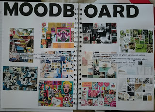
01/05/2018
'Find a range of illustrators that use a particular medium.
Catalogue the illustrators according to similarities in a way that they use tools and materials. How do they distort or exaggerate the representation of elements in their work? How do they communicate through use of metaphor or symbols?
Choose one image that you most appreciate visually. Ask yourself questions such as; How are colour, tone and texture used to evoke the mood or convey an idea? Has the illustrator distorted the content within the imagery and how does this work for the purpose the image fulfils?
Go back to a visual you created for an earlier exercise and now render it using the same tools and materials as your chosen artist.'
For this exercise I could not decide on one particular medium to choose from so I picked three, and then I picked three illustrator from each category to research. The mediums I chose to look at are; Traditional Illustration (Watercolour), Collage and Graphic Design.
Traditional Illustration
I illustrators I chose to look at for Traditional Illustration are:
 |
Philip Bannister - Research
|
Philip Bannister uses a distinctive watercolour style, but he loves experimenting with the medium. Often working in monotones, he’s able to accentuate the contrast in his imagery while at the same time drawing out crucial details.
2. Mae Besom
 |
| Mae Besom - Research |
Mae Besom uses traditional media, pencil and watercolour to create texture and light within her illustrations.
 |
Martha Napier - Research
|
Watercolours are Martha’s main media, but she also uses markers, pencils and acrylics. She scans the work into Photoshop and uses the application to clean it up and colour correct it before delivering it to her clients.
Collage
The illustrators I chose to look at for the medium Collage are:
 |
| Stefanie Clemen - Research |
The best way to start a job is to begin drawing, and that’s what Stefanie does, exploring ideas and refining them. The materials she uses will vary depending on the commission and the look and feel she’s after.Most images are started using traditional media, then digitised with a scanner. Stefanie also enjoys a mixed media approach, with everything from chewing gum wrappers to small pressed flowers making their way into her work.
2. Martha Von Maydell
 |
Martha Von Maydell - Research
|
3. Emma Rios
 |
Emma Rios - Research
|
Graphic Illustration
The three Graphic Illustrators I chose to research are:1. Danny Allison
 |
Danny Allison - Research
|
2. Lennart Gabel
 |
Lennart Gabel - Research
|
3. Butcher Billy
 |
Butcher Billy - Research
|
When I have researched the illustrators above I noticed that they all start with Traditional drawing for ideas then either moving onto collage or Photoshop.
The illustration I appreciate visually out of all the illustrators I have research is a piece from Martha Von Maydell. The image is below:
 |
Martha Von Maydell
|
I feel looking at this piece that it makes me feel happy, warm, summery. I feel this because of the multiple colours she has chosen for the background. The Black and white card she has chosen for the flowers stand out well against the background and immediately my eyes are draw to the flowers.
Martha Von Maydell did not need to distort this image for it to work I feel that the use of colours convey this image by themselves.
07/05/2018
Taking inspiration from Martha Von Maydell, I chose my sunglasses illustration to use for this exercise and below is the finished collage:

 |
| Collage Illustration |
I feel like this way of re-creating my illustration from a previous exercise has worked well, I like the colours I have used it makes the Sunglasses stand out, It's eye-catching and I feel its summery.
I also mentioned in my previous logs that i wanted to try this particular illustration in watercolours and so I did:
 |
| Watercolour Illustration |
The second piece of work I chose to revisit for this exercise is my abstract piece. Here it is below:
 |
| Collage Illustration |
I feel this doesn't work as well as my previous choice but the black and white still draws you eyes to the main piece of the illustration.
I feel that the whole of this exercise has been successful, I have liked experimenting with different media. I think in the future I might try and incorporate more media into my illustrations.


Comments
Post a Comment