Exercise: A Menu Card
A Menu Card
16/06/2018
' For this exercise you are asked to provide an illustration for use on the menu of a sophisticated, quality fish restaurant, the restaurant is modern, bright and contemporary in design. Any food depicted needs to be visually appetising.
Although the image will be used at a small size on the actual menu, if it is successful the restaurant would be interested in also using the image as a logo on their stationary and vans.
You will probably want to work on the artwork at a large scale but you need to provide an example reduced to 40mmx40mm as it will initially be used.'
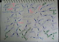
I began with making two moodboards. The first moodboard is google searched of contemporary restaurant logo's, The second is a google search on fish logo's:
 |
| Contemporary Restaurant Moodboard |
 |
| Fish Restaurant Moodboard |
I couldn't find a lot of existing fish restaurant logo's on just google search so I took some inspiration from what I had already found. I did some sketches of some quick ideas that came to my head and colour schemes:
 |
| Sketchbook Ideas_01 |
I decided that from these sketch's I liked best Idea_03 and Idea_4, I took these separately and quickly added and tested colours with both these ideas:
 |
| Idea_03 - Colour Schemes |
 |
| Idea_04 - Colour Schemes |
I feel both these ideas have some strong elements, I feel that idea_03 could be a really strong logo but I feel looking at it that the Ying and Yang Idea has been use too many time just in general and I didn't want my restaurant idea to become another generic idea.
Idea_04 is strong in different ways I gave the fish a contemporary design and an element of mosaic style without overdoing it. I test different colours and I think Turquoise into blue or green would look best on this logo.
Idea-04 is the Idea I am going to take forward because I feel It could have a lot of potential to develop the idea further.
18/06/2018
I did The final logo in photoshop and here is the final result:
 |
Restaurant Logo Final
|
I went ahead and quickly put this logo on two different styles of menus here are the results:
 |
| Menu_01 |
 |
| Menu_02 |
I feel that my logo works well on the second menu. It stands out it work well with blues, turquoise's and greens. The menu itself I feel is very modern and a clean design.
 |
| 40mm x 40mm |


Comments
Post a Comment