Exercise: Travel Guides
Travel Guides
13/02/2019
' Your brief is too produce three illustrations for a series of book jackets, Travel guides, for the locations:
Istanbul Helsinki Milan
The client would like you to create illustrations in which many elements are brought together in a diagrammatical way. They would like also like the type to be hand drawn in an appropriate style.
Write yourself a brief that is challenging but manageable. Be aware of the process which have led to your development in idea generation, visual research, image construction, understanding context and media usage.
Provide Client visuals for all three covers and a mock up of one.'
I started by writing a brief for this exercise, I just outlined the main parts of the brief and I picked a size for the book itself which the most popular size is 6x9inches.
Next I did three moodboards one for each location:
 |
| Istanbul Moodboard |
 |
| Helsinki Moodboard |
 |
| Milan Moodboard |
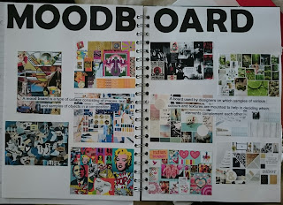
Then I created a moodboard for travel guides to see what was out there and to get some inspiration:
 |
| Travel Guide Moodboard |
Next I made a mind map to get a few ideas that where floating around in my head down on paper:
 |
| Mind Map |
Next I went onto google and had a look through different types and the whole alphabet in that sort of type. I picked my three favourite types for each location and hand drawn them out (like the client wanted):
 |
| Istanbul Type |
 |
| Milan Type |
 |
| Helsinki Type |
I made a mistake whilst drawing out the Helsinki Type so I corrected it with post it notes! I have picked for Milan the first type I drew out, For Helsinki the second type and I haven't yet made my mind up for Istanbul but its between the first and second type designs, So, I think I will do try the two in my mock-ups if I haven't decided before then.
Next I did some sketch design ideas:
 |
| Istanbul Ideas |
 |
| Milan Ideas |
 |
| Helsinki Ideas |
I did front cover, spine and back cover design for all locations. I decided that the books will have the same layout so we can tell that they all relate to each other.
First I am going to design the layout in Photoshop then I will pick which design I am going to develop from each of my Ideas.
For Istanbul I have decided to go for idea number three as I think number two would be the too obvious design and I feel that a lot of people would automatically incorporate a map into their design. For Milan again design number three, and Helsinki design number three. It does say I'm going to hand draw and use water colour on them but I feel this would be too repetitive and could get boring so I am going to try different approaches. I have found some images that caught my eye using different ways of colouring the image so I may draw some inspiration from them:


These images are from a random google search and I just stumbled across them.
I decided to work in Photoshop as I am not very confident with my watercolour painting skills at the moment but I still wanted the water colour effect.


As the brief says that the client wanted the Typography hand drawn. So I imported my hand drawn type into photoshop and I haven't manipulated it in anyway as in cleaned up edges etc. I have only enlarged the Type to fit the 'Header'.
I decided that I should do Mock-ups of the back cover as well. I kept it the same colour as the sky to keep it consistent with the front. The spine of the book cover holds the flag and again the name of the city, I added a tiny Whirling Dervish on the spine which I think was a nice touch to add. I added some text on the back which describes Istanbul and then added a bar code for realism and where I would put the bar code in the design.
I wasn't quite happy with the design so I played around with it and changed a few things:


I felt that the white boxes that held the text looked like it was floating around so I changed it to a dark blue which I got the colour from the picture I used. The black text against the blue looked like it didn't exist so I changed it to white which I feel looks a lot better than the black on white. I did the same with the text and the box on the back cover. I also added a mosque the top of the bar code.
Still looking at this I thought it needed abit more it looked bare and incomplete so I added and changed a few things around:

I still felt it was unfinished so I added the few last touches onto the front and back covers here is the finished versions of Istanbul Travel Guide Covers:


Next I started working on the Milan Travel Guide, I want to keep similar styles as this will link all the books together. Below is my first design of Milan Travel book:


The typography is hand drawn again and I like this type more than the other two I think it best suits Milan. I have kept the design the same as it symbolises the designer of the book I would say it is simple and not over worked.
I think I am happy with this design for Milan and I don't think I want to change anything else on it so I will use this as a final design for Milan. I may try a brighter colour just to see what it looks like:


I had 2x votes for Blue, 2x votes for yellow and 3x votes for purple. So by the peoples choice I will have purple as my final design for Milan.
I started the Helsinki Travel Guide after the Milan, as before I am going to keep the same design. I kept all the same elements except changed the way I created it. Like every other design I always swapped the texture I was using and the watercolour base I was adding to the photo otherwise I would Get the same creation with each one and I wanted some sort of difference even if it was just minor. Below is my first design:


So Below are my three Final Travel Guides for Istanbul. Milan and Helsinki:


Look at all the designs I am real happy with how they have all turned out, You can call these a series of books, they all relate to each other with all elements but at the same time have all turned out differently.
The exercise says to make one mock up of the book but I made them all. I think if I had to chose to present one I would pick Helsinki, I think I like the colours best in this one and especially how the image turned out.


Comments
Post a Comment