Exercise: Working for Children
Working For Children
04/04/2019
' Collect as many examples of imagery for children as possible. Group the illustrations you've collected into a target age groups.
Pre-Reader Pre-School (3-5) Early Reader (5-7) Established Reader (7-9)
Older Age Groups
Take two of these age groups and, for each one, go through a process of brainstorming around at least one word chosen from this list:
Festival Scary Wild Growing Journey Sad Family Discovery
Pick an animal appropriate for each age group and brainstorm to identify themes, images and ideas pertinent to your age groups.
Create a simple image of your animal engaged in an activity that communicates this word. Remember that you're creating the world in which your character operates.
Explore the colours and materials to use for your illustration.
Are the target age brackets for children really as clear-cut as we've made them here? How did the function of image and text differ within the different age groupings? what is your response to the idea 'all children's illustration has bright colours? '
I started this exercise with moodboards for each of the target age groups:
 |
| Moodboard |
 0 0 |
| Moodboard |
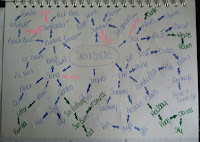
After the moodboards the next task was to pick two of the target age groups, I think I will choose Pre-Reader and Early Reader. I think there enough difference between them that I could do a brainstorm between the two. From the list of words I think I will pick Journey and I think it will also mix with Discovery too if my idea comes to life. Below are my two brainstorms:
 |
| Pre-Reader Mind Map |
 |
| Early Reader Mind Map |
Looking at the moodboards I can answer one of the questions asked in the brief.
'Are the target age brackets for children really as clear-cut as we've made them here?'
I feel that between Pre-Reader and Early years there's no clean cut differences, the colours are all the same for example mostly primary colours and the fonts big and bold and sometime colourful depending on the book. The characters to me have hardily any differences they are all basic and simple drawings meaning not too detailed. I feel the only time you start to be able to see a difference in the ages groups is when you get to the Established reader age when the drawings start to become very detailed and you see darker colours for example dark blues and blacks.
One thing that I did notice whilst researching Pre-Reader there was no books that I found that had different media for example I have seen in the past touch sensory books where every page has a different patch to feel and run your finger across. I wont be able to apply that to this exercise but I hope to use different types of media for depth.
Next I am going to create my two main characters which are the mouse I have chosen for Pre-Reader and a Dragon for Early Reader.

 |
| Mouse Character |
 |
| Peanut the Mouse |
Below are my Ideas:
 |
| Pre-Reader Idea |
 |
| First Mock Up |
There was a few things I needed to clean up on this image:
 |
| Second Mock Up |
Even though I had decided that the above image was my final image for Pre-Reader I decided to have a look at a different background.
 |
| Third Mock Up |
Next I picked Early Readers so I decided to go more of the mythical creature route. I picked a dragon and named her Dora the Dragon. I started to create Dora:

 |
| Dora the Dragon Close up |
 |
| Dora (Photoshop) |
Because I was keeping the same content but making it more for Early Readers I didn't have to think much of how I wanted it to look:
 |
| Mock Up One |
 |
| Mock Up Two |
 |
| Mock Up Three |
Below is a recap of my Final illustrations:
|
| Pre-Reader Final Illustration |
 |
| Early Reader Final Illustration |
So to answer the two remaining questions:
How did the function of image and text differ within the different age groupings?
When looking upon my research earlier there is little different between the fonts they still have the same largeness about them and easy and inviting font. The only difference was the colours that are used they started using darker colours. For the images themselves not much had changed they added a little more detail into the images themselves but did not make the drawing style different.
What is your response to the idea 'all children's illustration has bright colours?


Comments
Post a Comment